This post may contain affiliate links. If you click one, we may earn a commission at no cost to you. Here's more details on how we make money.
Hey there, color lovers! We're thrilled to bring you into the soft, dreamy world of cream color palettes. If you're anything like us, you appreciate how the right colors can transform a space, mood, or design.
Cream is one of those softly beautiful shades that brings a gentle warmth and versatility to any palette it graces. It's the cozy sweater of colors—comforting, classic, and effortlessly chic.
In this post, we're going to explore some of the most delightful cream color palettes that promise to inspire your next project or refresh your space. From the soft whispers of ivory and beige to the rich embrace of coffee and olive greens, these palettes weave together a tapestry of tones that speak to a variety of styles and preferences.
So, grab your favorite cup of coffee (or tea!), and let's explore the best colors that go with creamy goodness that awaits. Trust me, you're going to love the cozy vibes these palettes bring to the table!
1. Ice Cream Color Palette
Celeste + Celadon + Vanilla + Cherry Blossom Pink + Mauve
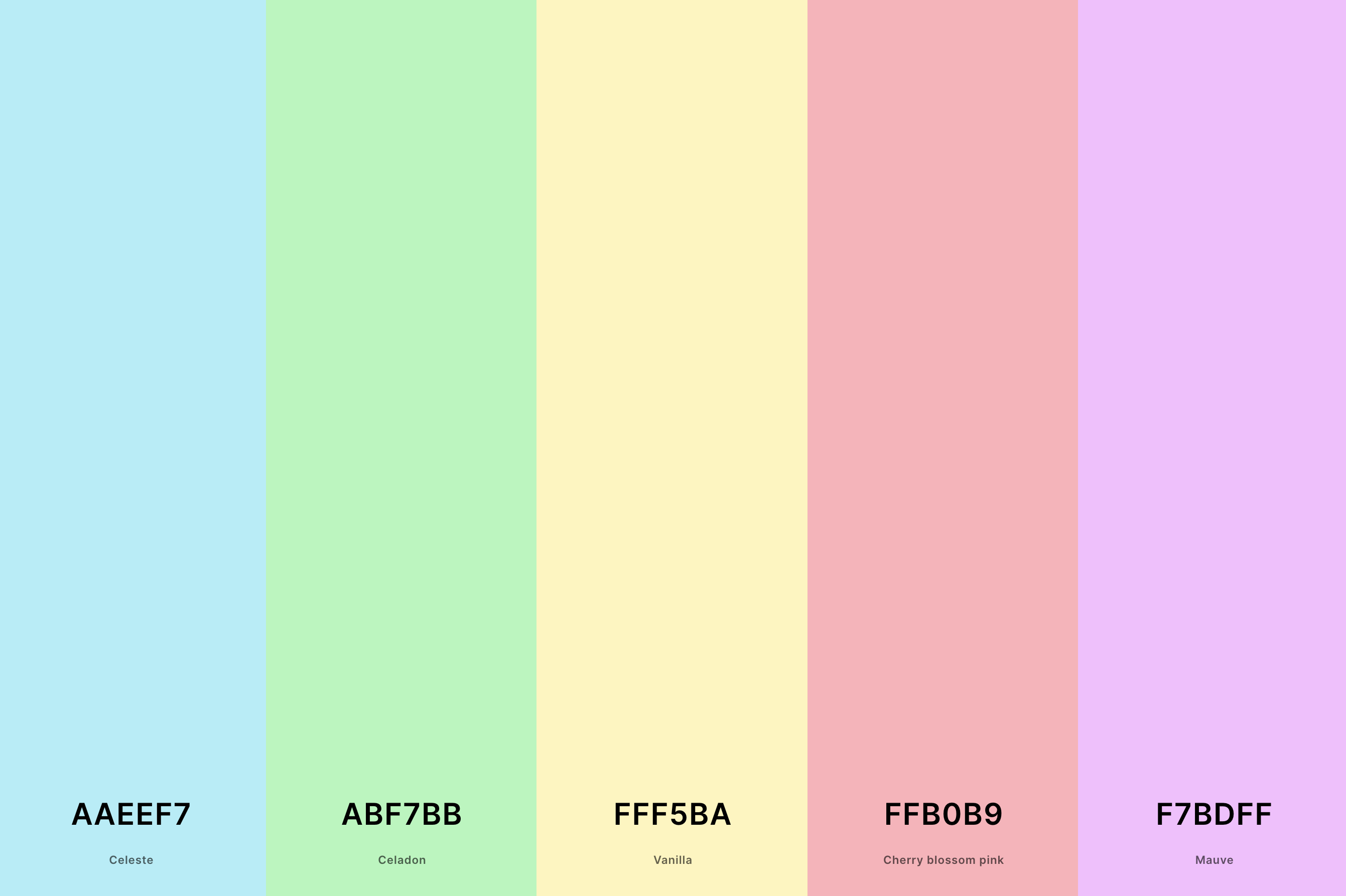
Hex Codes: #AAEEF7, #ABF7BB, #FFF5BA, #FFB0B9, #F7BDFF
This palette is like a sweet treat for your eyes! With soft Celeste and Celadon bringing in a refreshing coolness, contrasted by the warmth of Vanilla, Cherry Blossom Pink, and Mauve, it's a playful mix that evokes the joy of an ice cream parlor.
The balance between cool and warm tones creates a harmonious yet dynamic visual experience, perfect for designs that aim to be both comforting and cheerful.
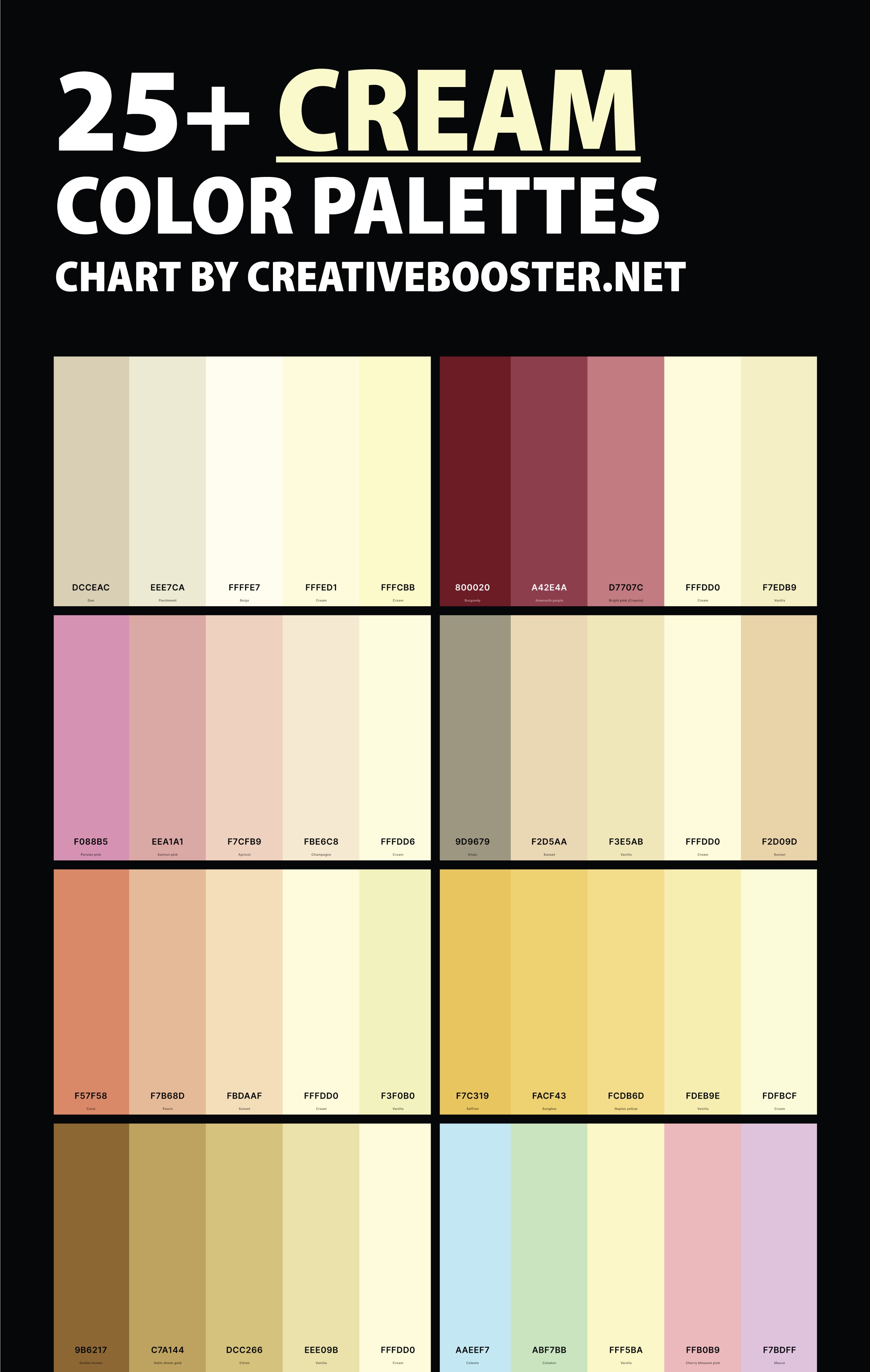
2. Cream Beige Color Palette
Dun + Parchment + Beige + Cream + Cream
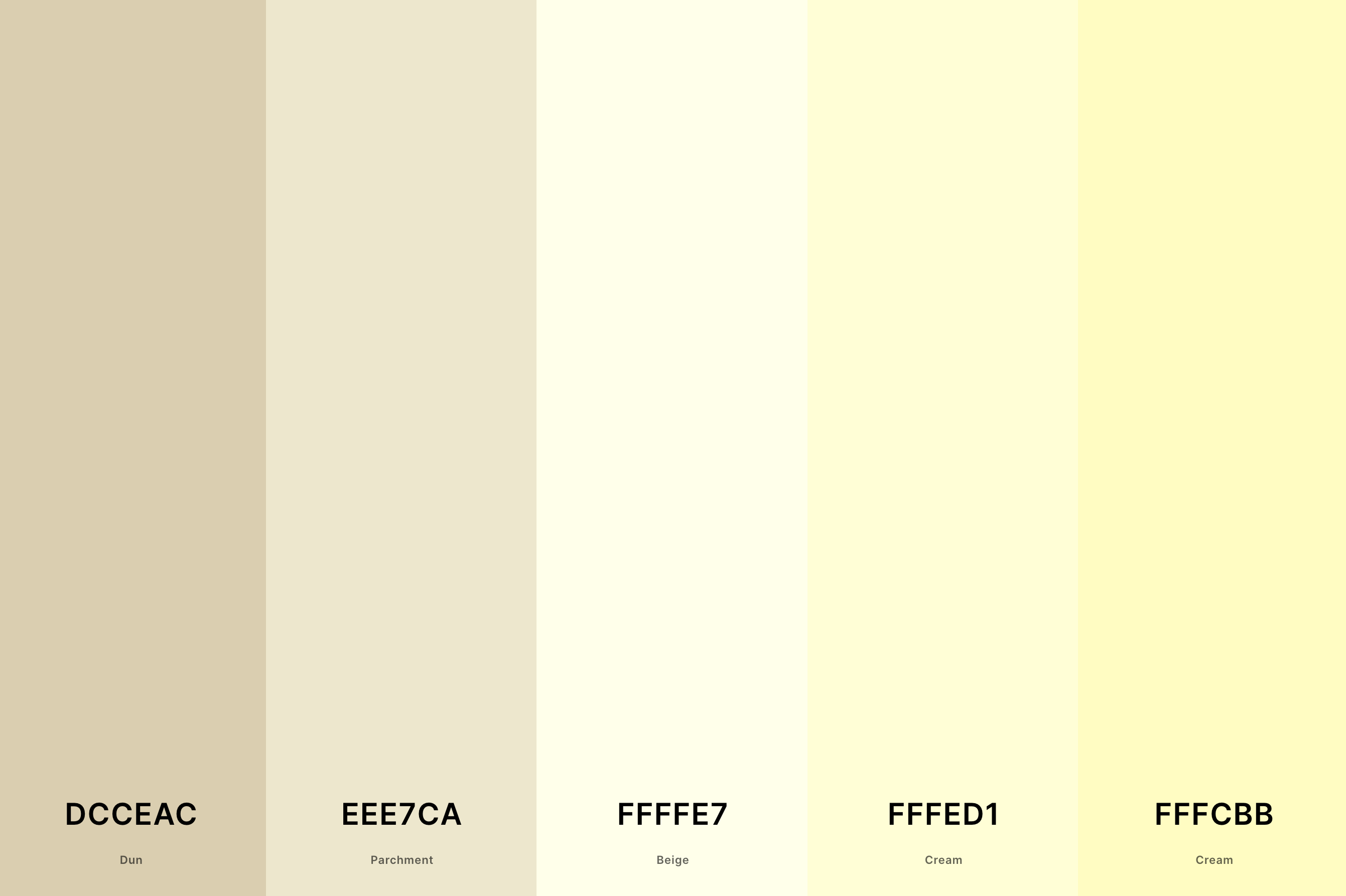
Hex Codes: #DCCEAC, #EEE7CA, #FFFFE7, #FFFED1, #FFFCBB
Ah, the elegance of neutrals! This palette is all about the subtle beauty of natural tones, from the earthy touch of Dun to the soft glow of Cream. It's a testament to the sophistication that lies in simplicity.
These shades work together to create a soothing, cohesive look that's versatile for any setting, embodying a timeless chic that's always in style.
3. Green And Cream Color Palette
Pakistan Green + Asparagus + Pear + Mindaro + Cream
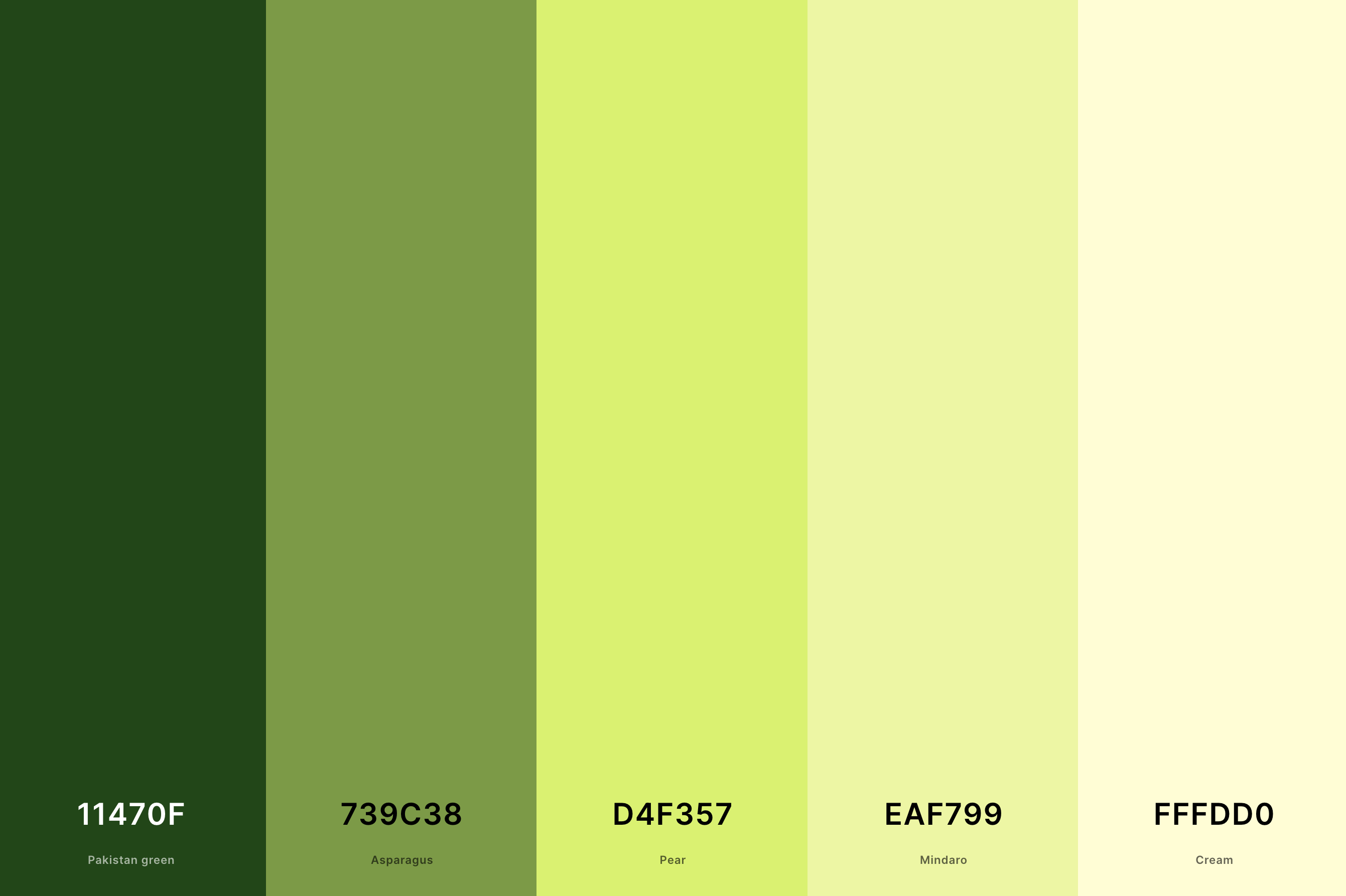
Hex Codes: #11470F, #739C38, #D4F357, #EAF799, #FFFDD0
Here's where nature meets luxury. The deep, rich Pakistan Green paired with vibrant shades like Asparagus and Pear, balanced by the lightness of Mindaro and Cream, brings an organic vibrancy to the mix.
This palette captures the essence of a lush garden at dawn, offering a fresh and revitalizing feel that's perfect for spaces needing a touch of life.
4. Cream And Coffee Color Palette
Bistre + Coffee + Khaki + Dutch White + Cream
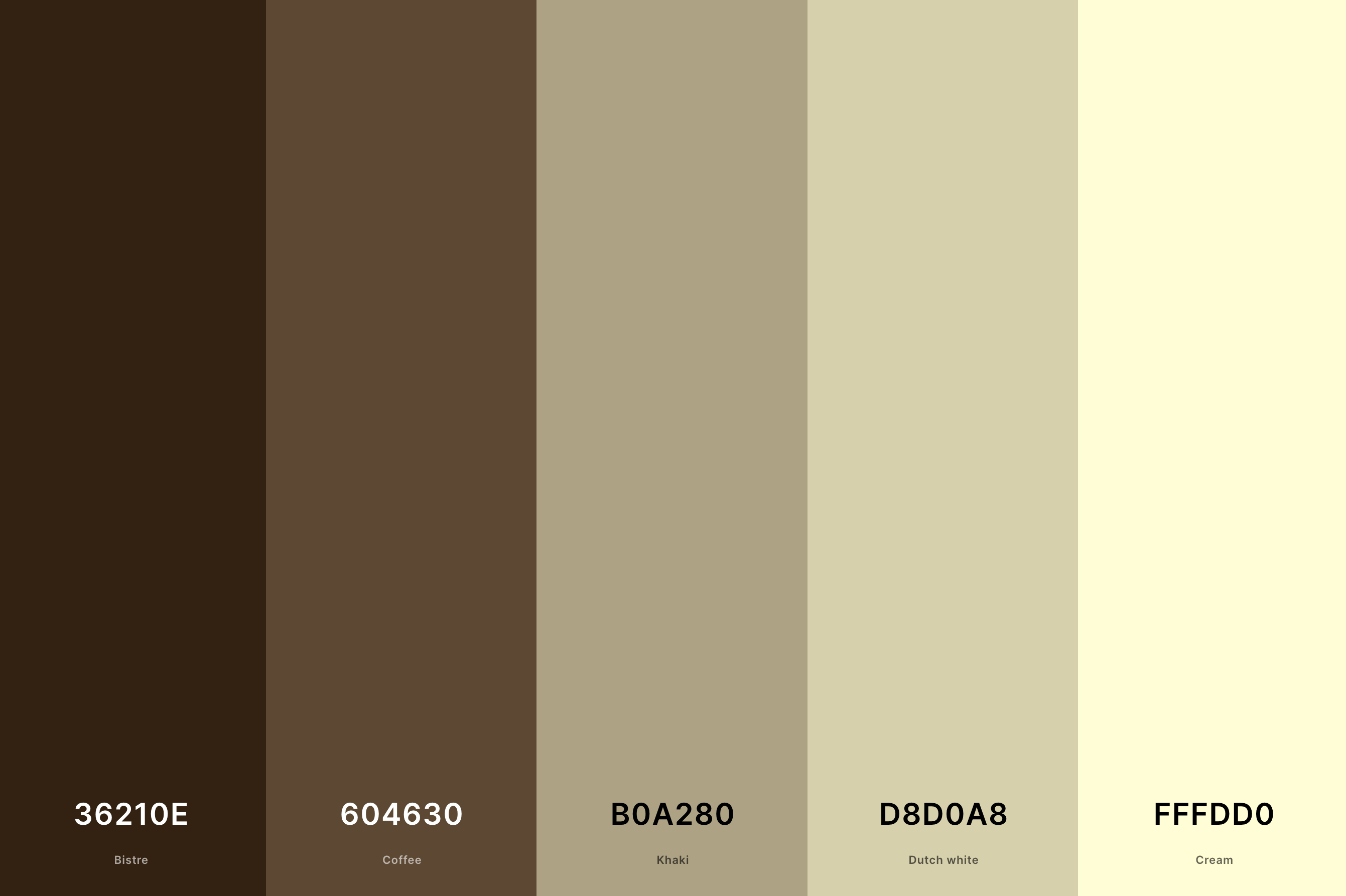
Hex Codes: #36210E, #604630, #B0A280, #D8D0A8, #FFFDD0
For those who appreciate the finer things in life, this palette is like a warm, inviting cup of coffee. The deep, robust Bistre and Coffee shades create a comforting foundation, while Khaki, Dutch White, and Cream lighten the mood.
It's a sophisticated blend that speaks of cozy afternoons in a chic café, making it ideal for creating an ambiance of refined comfort.
5. Blue And Cream Color Palette
Bice Blue + Air Superiority Blue + Light Blue + Honeydew + Ivory
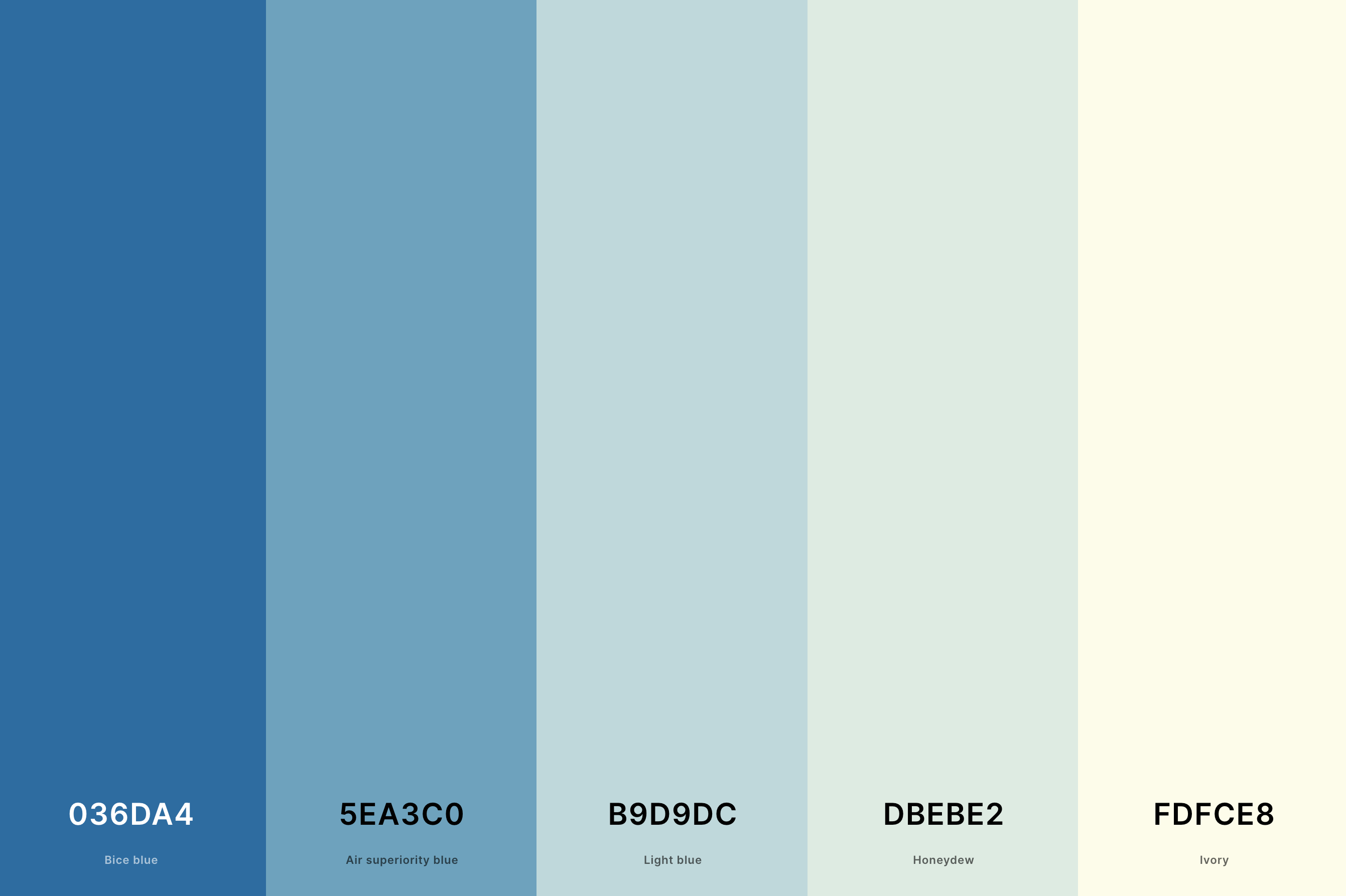
Hex Codes: #036DA4, #5EA3C0, #B9D9DC, #DBEBE2, #FDFCE8
This palette takes you on a serene journey to the seaside, with Bice Blue and Air Superiority Blue reflecting the depths of the ocean, complemented by the calm of Light Blue and Honeydew.
Ivory adds a touch of softness, reminiscent of sandy beaches. It's a refreshing and tranquil combination, perfect for evoking a sense of calm and clarity in your space.
6. Brown And Cream Color Palette
Bistre + Kobicha + Lion + Dun + Ivory
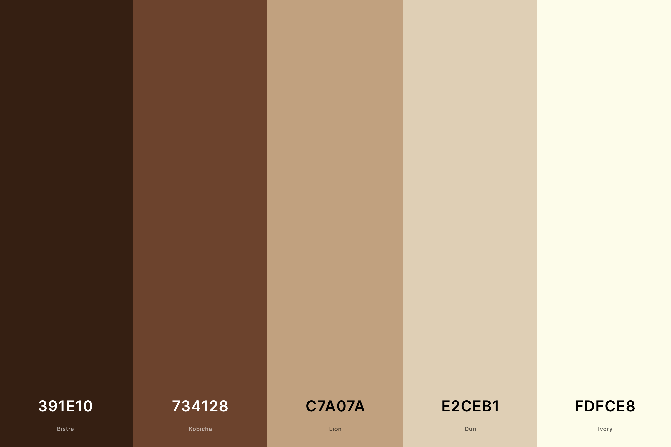
Hex Codes: #391E10, #734128, #C7A07A, #E2CEB1, #FDFCE8
This palette is like a warm embrace, with the comforting richness of Bistre and Kobicha melding beautifully with the softer Lion, Dun, and Ivory shades.
It's reminiscent of a cozy cabin in the woods, where the warmth of wooden interiors meets the softness of daylight.
This blend is perfect for spaces that aim to be both inviting and grounded, offering a sense of stability and warmth.
7. Sage Green And Cream Color Palette
Taupe + Sage + Pearl + Beige + Dutch White
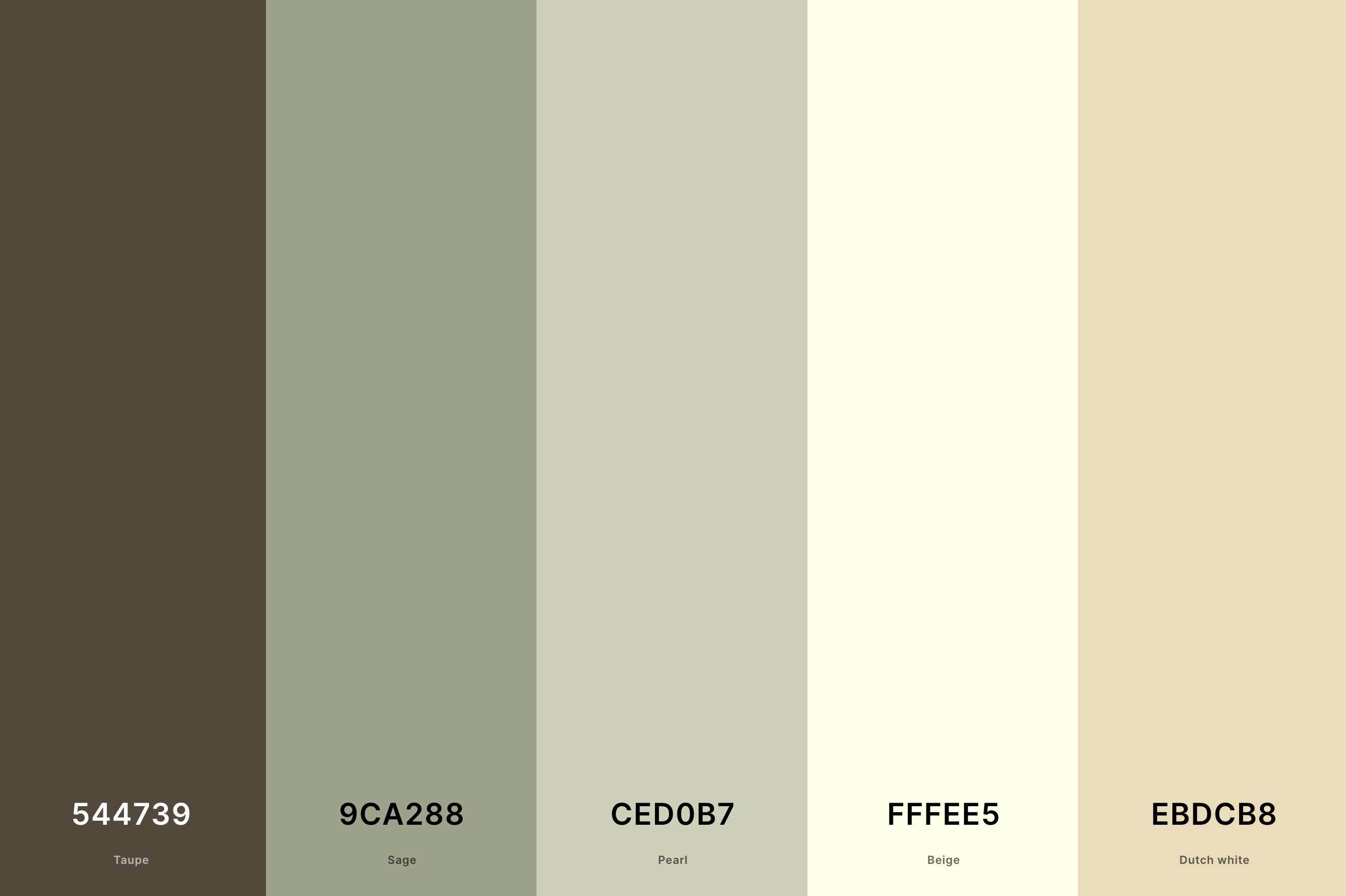
Hex Codes: #544739, #9CA288, #CED0B7, #FFFEE5, #EBDCB8
There's something so soothing about this palette. The earthy Taupe and Sage create a grounded feel, while Pearl and Beige lighten the mood, and Dutch White adds a gentle highlight. It's like a breath of fresh air in a serene meadow at dawn.
This palette is ideal for creating a peaceful, restful environment, where the hustle of the world fades away.
8. Black And Cream Color Palette
Black + Ecru + Flax + Vanilla + Beige
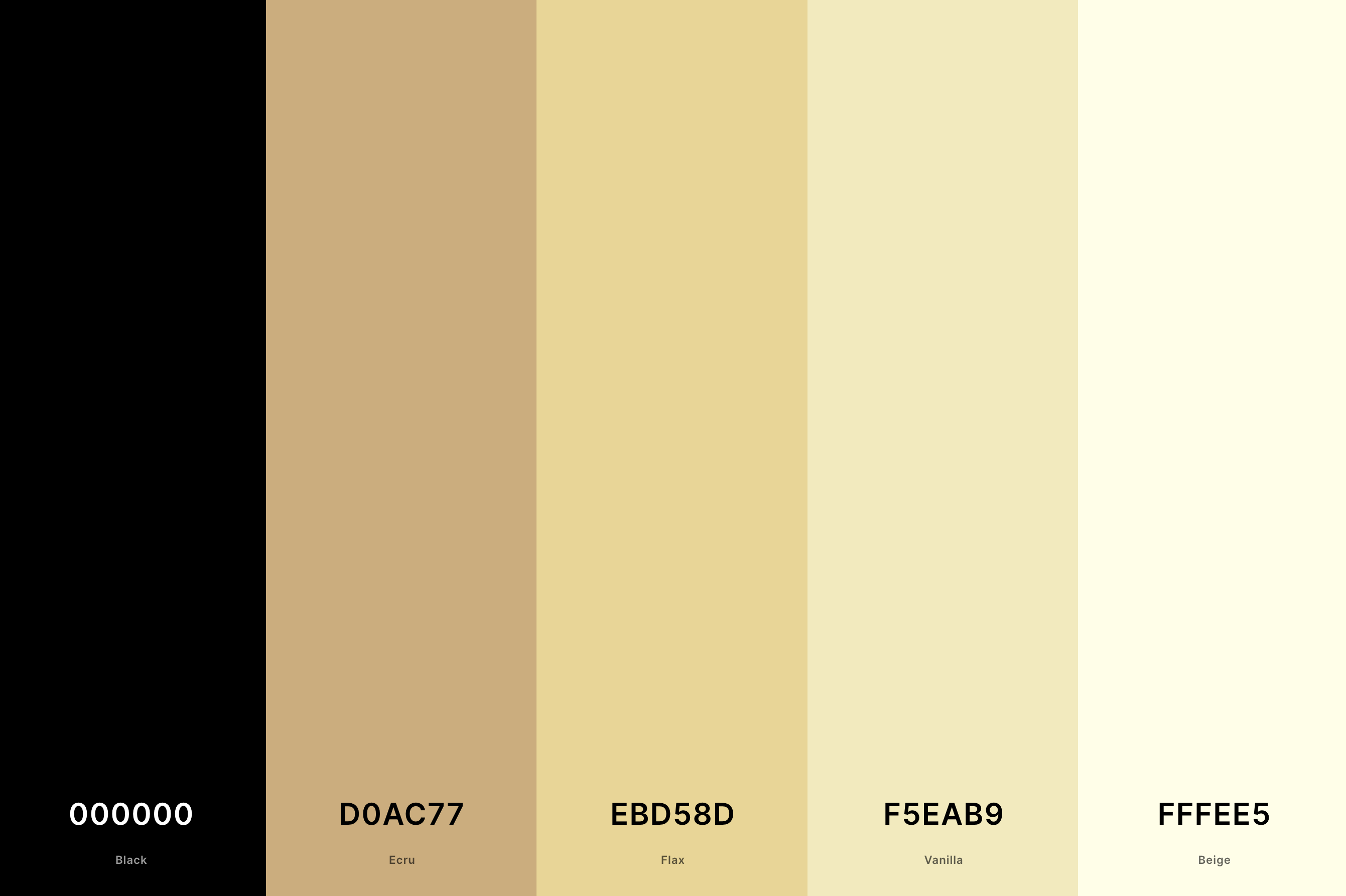
Hex Codes: #000000, #D0AC77, #EBD58D, #F5EAB9, #FFFEE5
Bold meets elegance in this striking combination. The stark Black contrasts dramatically with the softer tones of Ecru, Flax, Vanilla, and Beige, creating a stunning visual impact.
This palette is all about sophistication with an edge, perfect for modern spaces that aim to make a statement while maintaining an air of classic refinement.
9. Brown, Cream And Green Color Palette
Bistre + Café Noir + Asparagus + Olivine + Cream
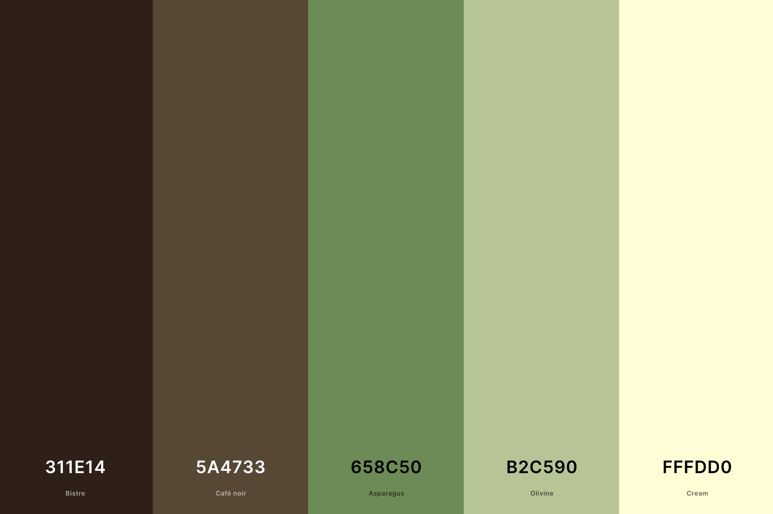
Hex Codes: #311E14, #5A4733, #658C50, #B2C590, #FFFDD0
Here we have a palette that tells a story of nature's bounty, with the deep, earthy Bistre and Café Noir grounded by the vitality of Asparagus and Olivine, and softened by Cream.
It's like a walk through a lush forest, where the richness of the earth meets the freshness of the foliage. This palette is wonderful for spaces that aim to reflect the beauty and abundance of the natural world.
10. Burgundy And Cream Color Palette
Burgundy + Amaranth Purple + Bright Pink (Crayola) + Cream + Vanilla
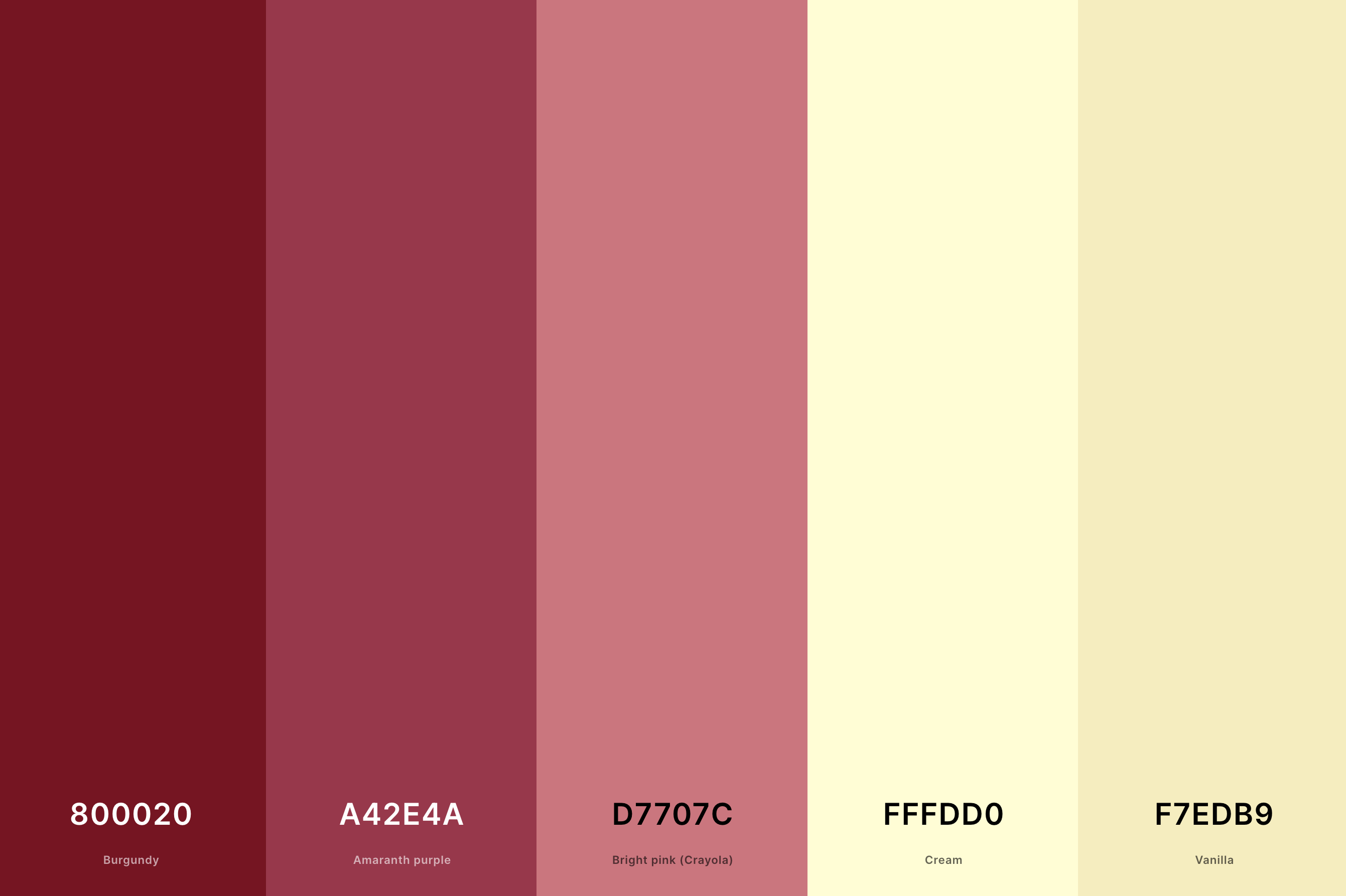
Hex Codes: #800020, #A42E4A, #D7707C, #FFFDD0, #F7EDB9
Oh, the drama and romance of Burgundy paired with the softness of Cream and Vanilla! Amaranth Purple and Bright Pink (Crayola) add layers of passion and playfulness.
This palette is like a bouquet of late autumn roses, full of depth and warmth. It's perfect for creating spaces that feel luxurious and enveloping, with a touch of vintage charm.
11. Cream And Gold Color Palette
Golden Brown + Satin Sheen Gold + Citron + Vanilla + Cream
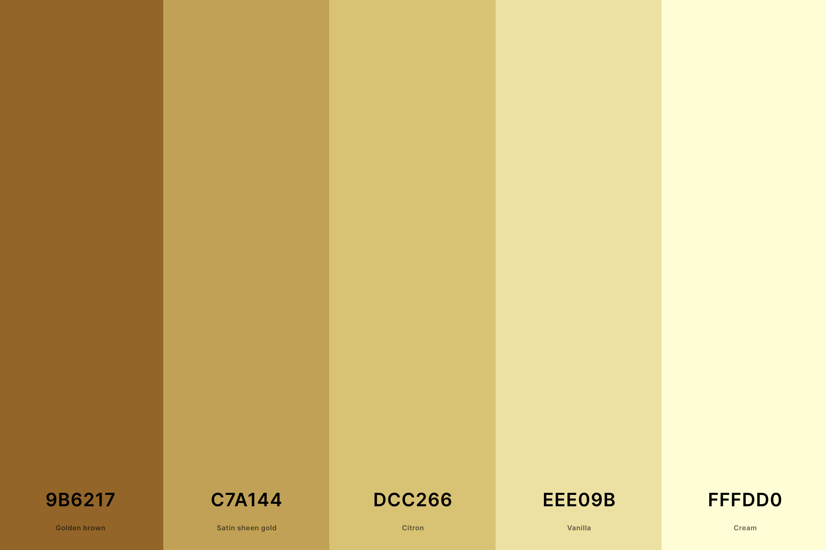
Hex Codes: #9B6217, #C7A144, #DCC266, #EEE09B, #FFFDD0
This palette is like a ray of sunshine, with the radiant warmth of Golden Brown and Satin Sheen Gold complemented by the zesty Citron. Vanilla and Cream add a soft, dreamy quality, reminiscent of a golden hour glow.
It's perfect for spaces that aim to be bright, uplifting, and filled with positive energy, infusing a touch of luxury and joy.
12. Cream And Grey Color Palette
Davy'S Gray + Battleship Gray + Dun + Bone + Beige
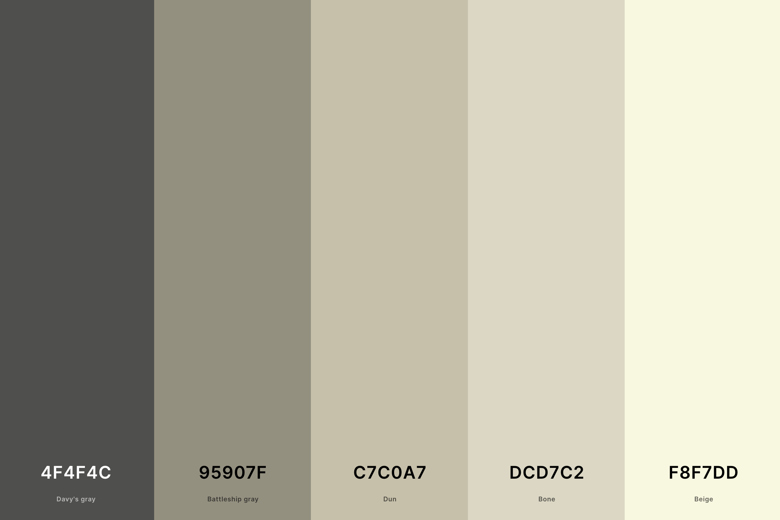
Hex Codes: #4F4F4C, #95907F, #C7C0A7, #DCD7C2, #F8F7DD
There's a sophisticated subtlety in this palette, where the sleek Davy's Gray and Battleship Gray meet the gentle Dun and Bone, with Beige tying everything together. It's like the quiet beauty of a misty morning, serene and calming.
This palette is ideal for creating spaces that are modern, chic, and imbued with an understated elegance, providing a tranquil backdrop to daily life.
13. Cream And White Color Palette
Lemon Chiffon + Cornsilk + Cornsilk + Ivory + Baby Powder
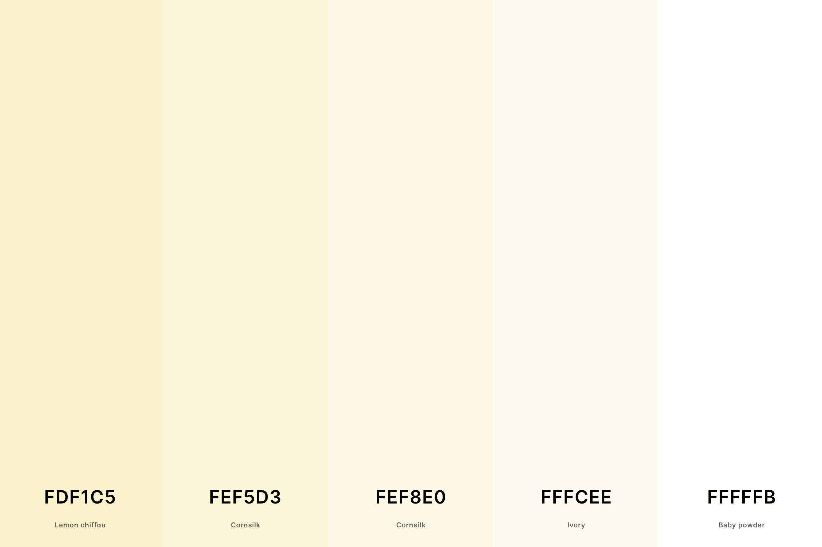
Hex Codes: #FDF1C5, #FEF5D3, #FEF8E0, #FFFCEE, #FFFFFB
Pure, ethereal, and absolutely timeless, this palette blends the softest shades of Lemon Chiffon and Cornsilk with the pristine purity of Ivory and Baby Powder.
It's like being surrounded by soft, fluffy clouds, creating a space that feels open, airy, and infinitely peaceful.
Perfect for those who love a minimalist approach with a touch of warmth, this palette brings a sense of lightness and space.
14. Cream, Blue And Green Color Palette
Fern Green + Pistachio + Beige + Carolina Blue + Delft Blue
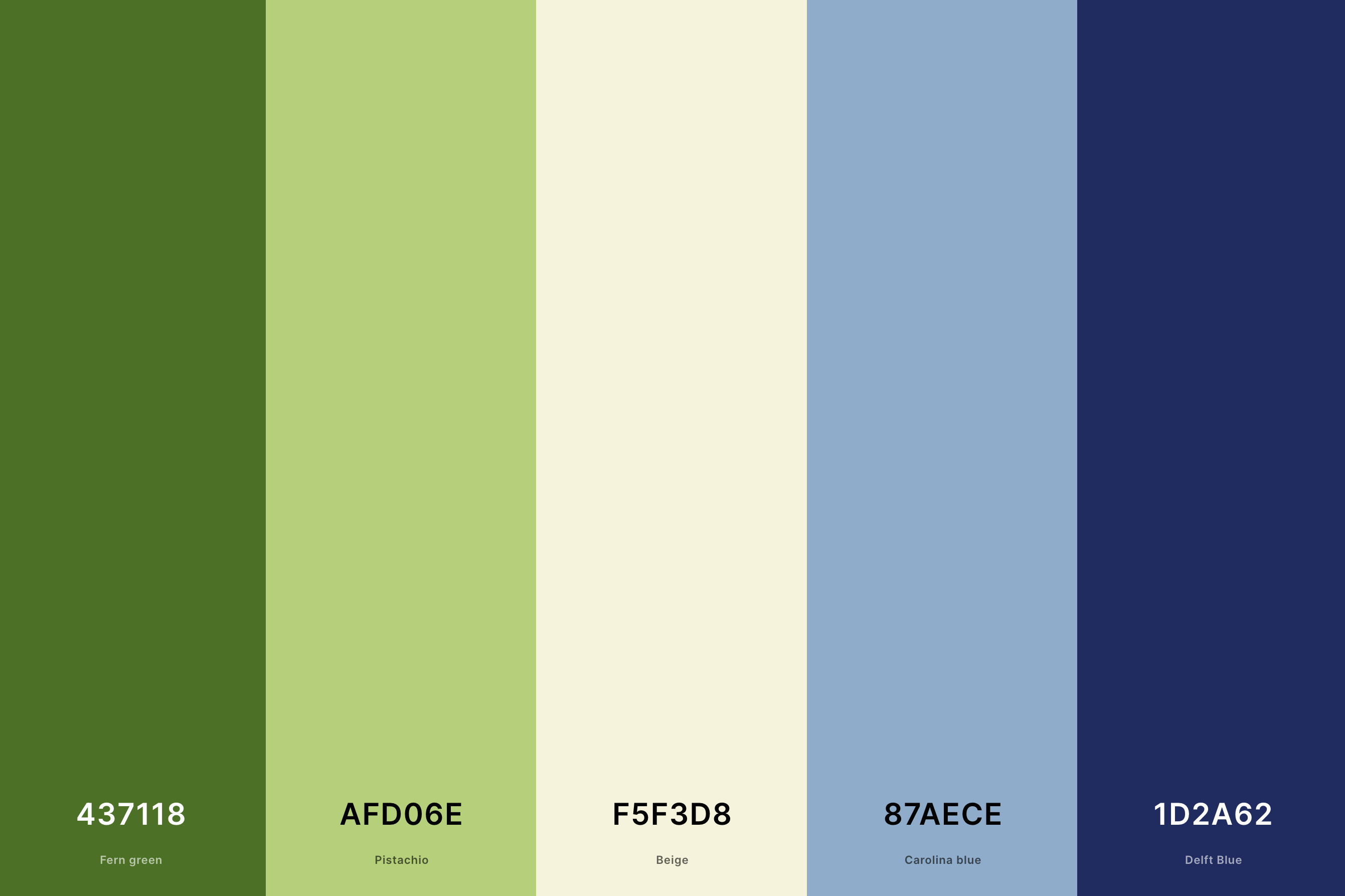
Hex Codes: #437118, #AFD06E, #F5F3D8, #87AECE, #1D2A62
This palette takes inspiration from nature's palette, with the deep Fern Green and vibrant Pistachio bringing life and energy, complemented by the softness of Beige, Carolina Blue, and Delft Blue.
It's like a panoramic view of the countryside, from lush fields to clear skies. Ideal for spaces that aim to be refreshing, rejuvenating, and connected to the natural world, this palette offers a harmonious balance between vibrancy and calm.
15. Cream And Pink Color Palette
Persian Pink + Salmon Pink + Apricot + Champagne + Cream
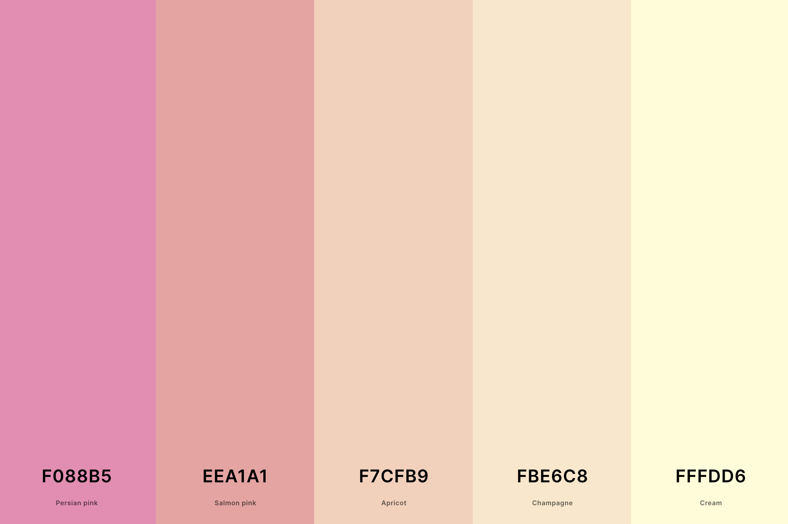
Hex Codes: #F088B5, #EEA1A1, #F7CFB9, #FBE6C8, #FFFDD6
Soft, romantic, and utterly charming, this palette combines the sweet allure of Persian Pink and Salmon Pink with the gentle Apricot and Champagne, all grounded by the soothing Cream.
It's reminiscent of a delicate floral arrangement, evoking feelings of love and tenderness. Perfect for spaces that seek to be feminine, soft, and nurturing, this palette wraps you in a gentle embrace of warmth and affection.
16. Cream And Yellow Color Palette
Saffron + Sunglow + Naples Yellow + Vanilla + Cream
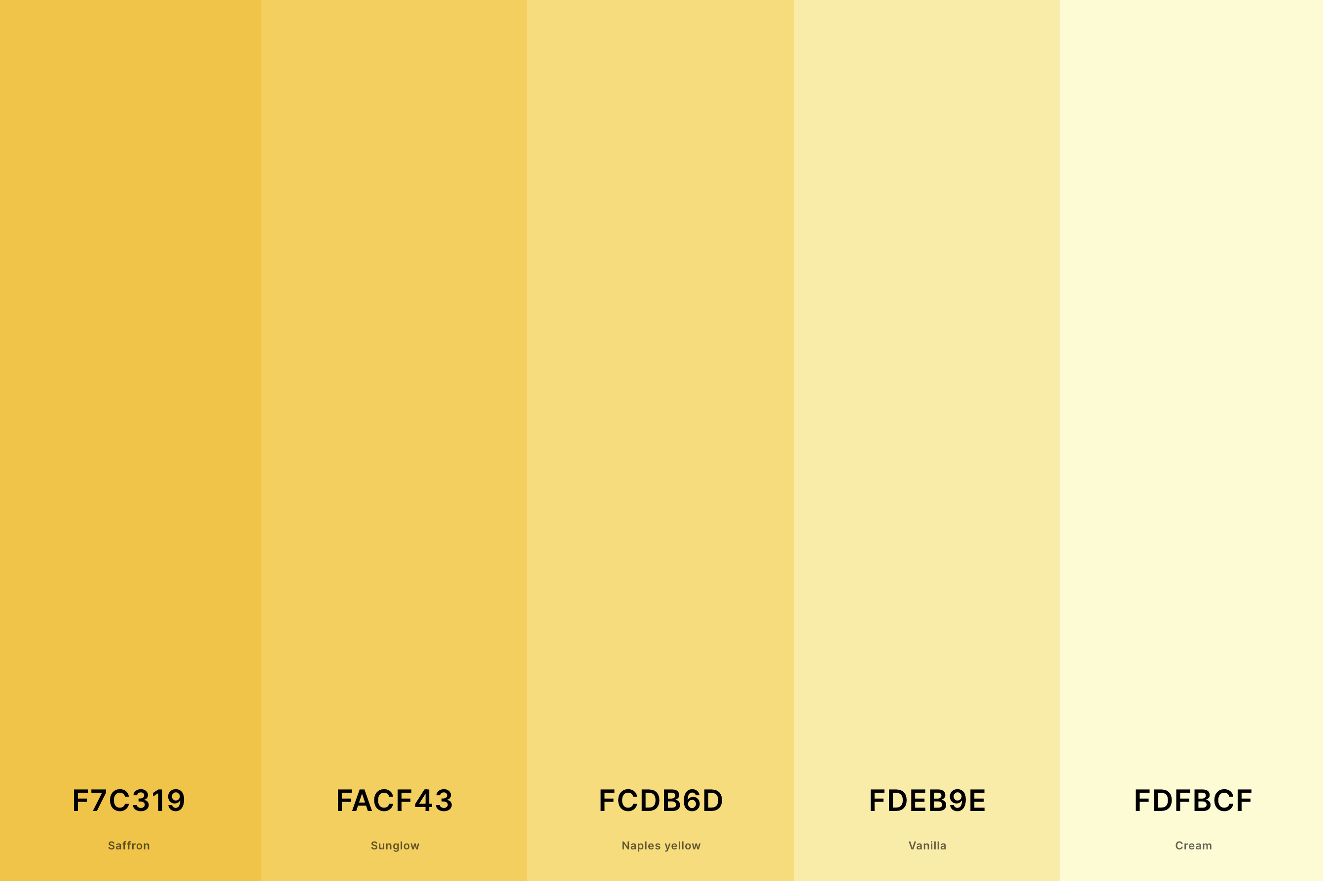
Hex Codes: #F7C319, #FACF43, #FCDB6D, #FDEB9E, #FDFBCF
This palette is like a splash of sunshine on a bright day, with the vibrant Saffron and Sunglow bringing a burst of energy, softened by the mellow tones of Naples Yellow and Vanilla. Cream adds a smooth finish, creating a cheerful and inviting vibe.
It's perfect for spaces that aim to inspire happiness, warmth, and a sense of welcome, much like a sunny day that brightens your spirits.
17. Pastel Cream Color Palette
Columbia Blue + Nyanza + Mimi Pink + Champagne Pink + Cream
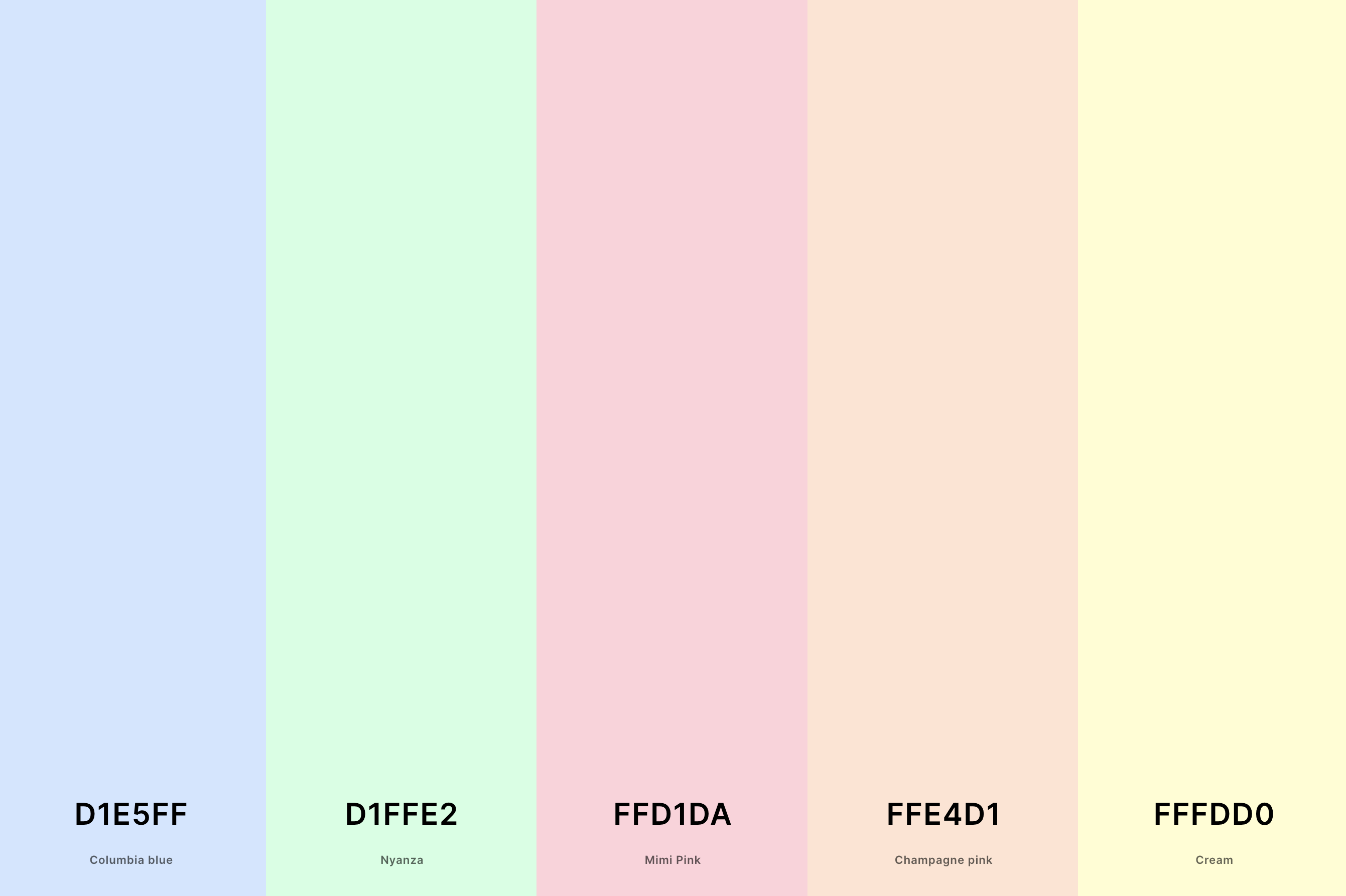
Hex Codes: #D1E5FF, #D1FFE2, #FFD1DA, #FFE4D1, #FFFDD0
Delicate and whimsical, this palette combines the airy Columbia Blue and Nyanza with the tender Mimi Pink and Champagne Pink, all anchored by the gentle touch of Cream.
It's like a soft, dreamy watercolor painting, evoking a sense of tranquility and soft romance. Ideal for spaces that seek a light, feminine touch, this palette offers a soothing escape from the hustle of everyday life.
18. Ivory And Cream Color Palette
Sage + Dutch White + Cream + Ivory + Alabaster
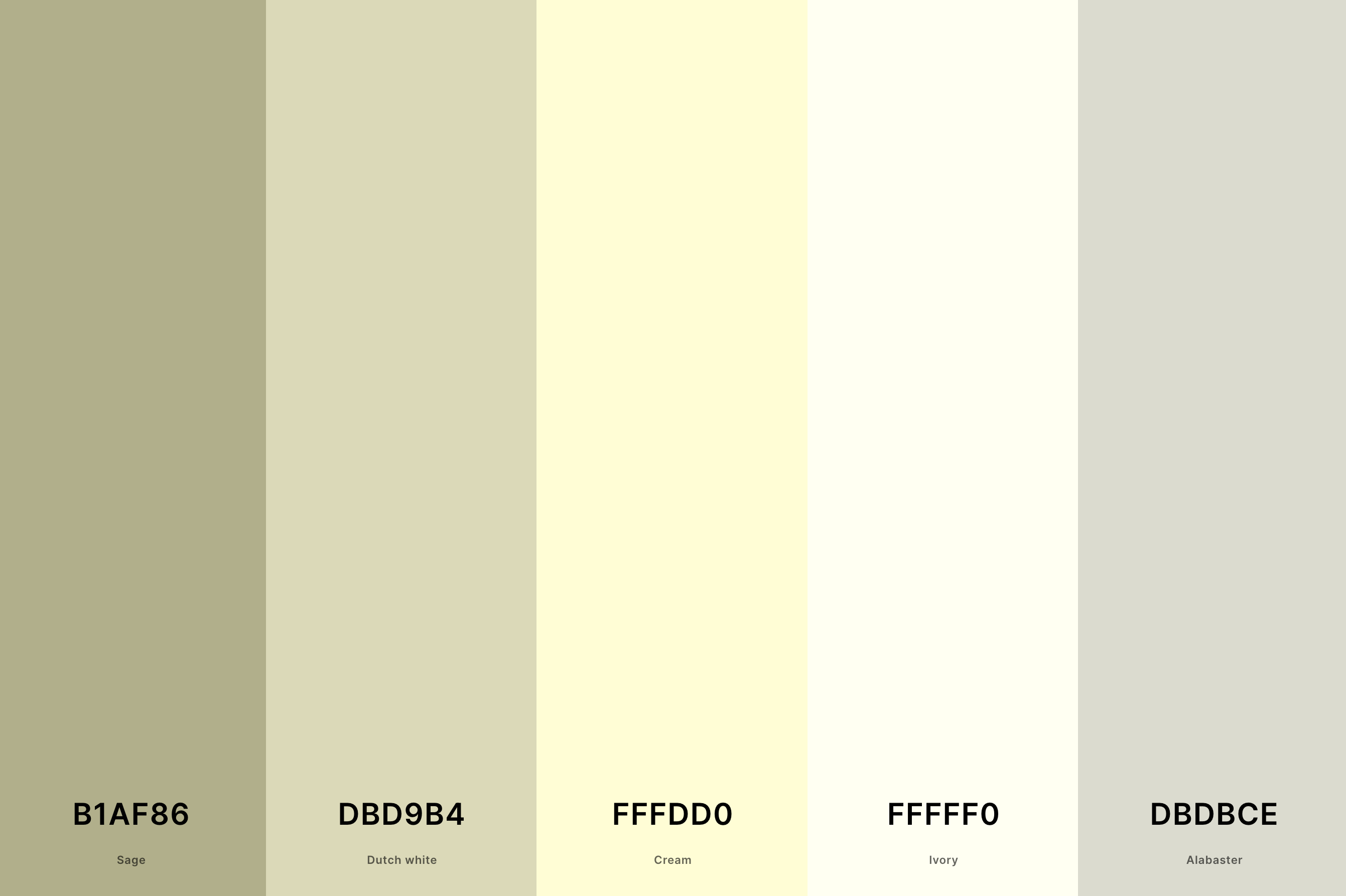
Hex Codes: #B1AF86, #DBD9B4, #FFFDD0, #FFFFF0, #DBDBCE
Embodying elegance and simplicity, this palette blends the subtle sophistication of Sage and Dutch White with the pure, luminous qualities of Cream and Ivory, highlighted by the soft Alabaster.
It's like the soft glow of dawn, bringing a new day's promise of freshness and renewal. Perfect for creating spaces that are serene, graceful, and imbued with a timeless charm, this palette speaks to the lover of minimalist beauty.
19. Cream And Peach Color Palette
Coral + Peach + Sunset + Cream + Vanilla
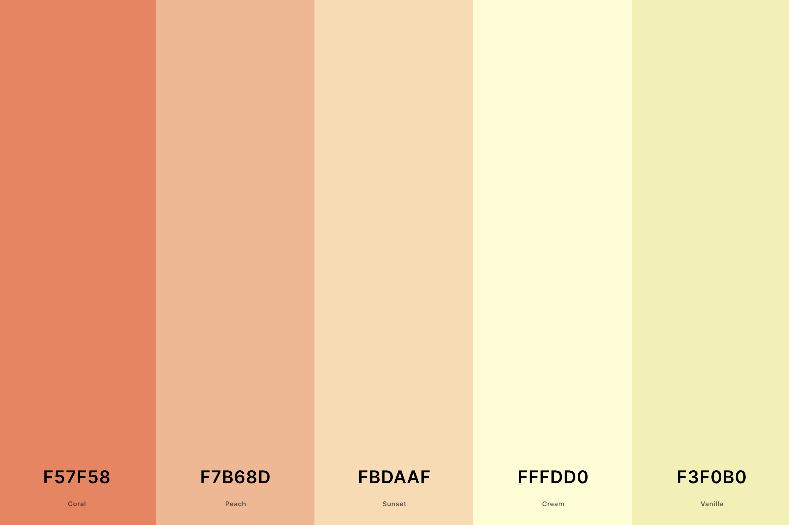
Hex Codes: #F57F58, #F7B68D, #FBDAAF, #FFFDD0, #F3F0B0
Warm, inviting, and subtly vibrant, this palette marries the juicy allure of Coral and Peach with the soft Sunset hues, all harmonized by the comforting presence of Cream and Vanilla.
It's reminiscent of a serene sunset, where the sky is painted in soft, warm tones, offering a sense of calm and contentment. Ideal for spaces that aim to be cozy, nurturing, and gently energizing, this palette wraps you in a warm embrace.
20. Red And Cream Color Palette
Ou Crimson + Fire Brick + Coral Pink + Lemon Chiffon + Vanilla
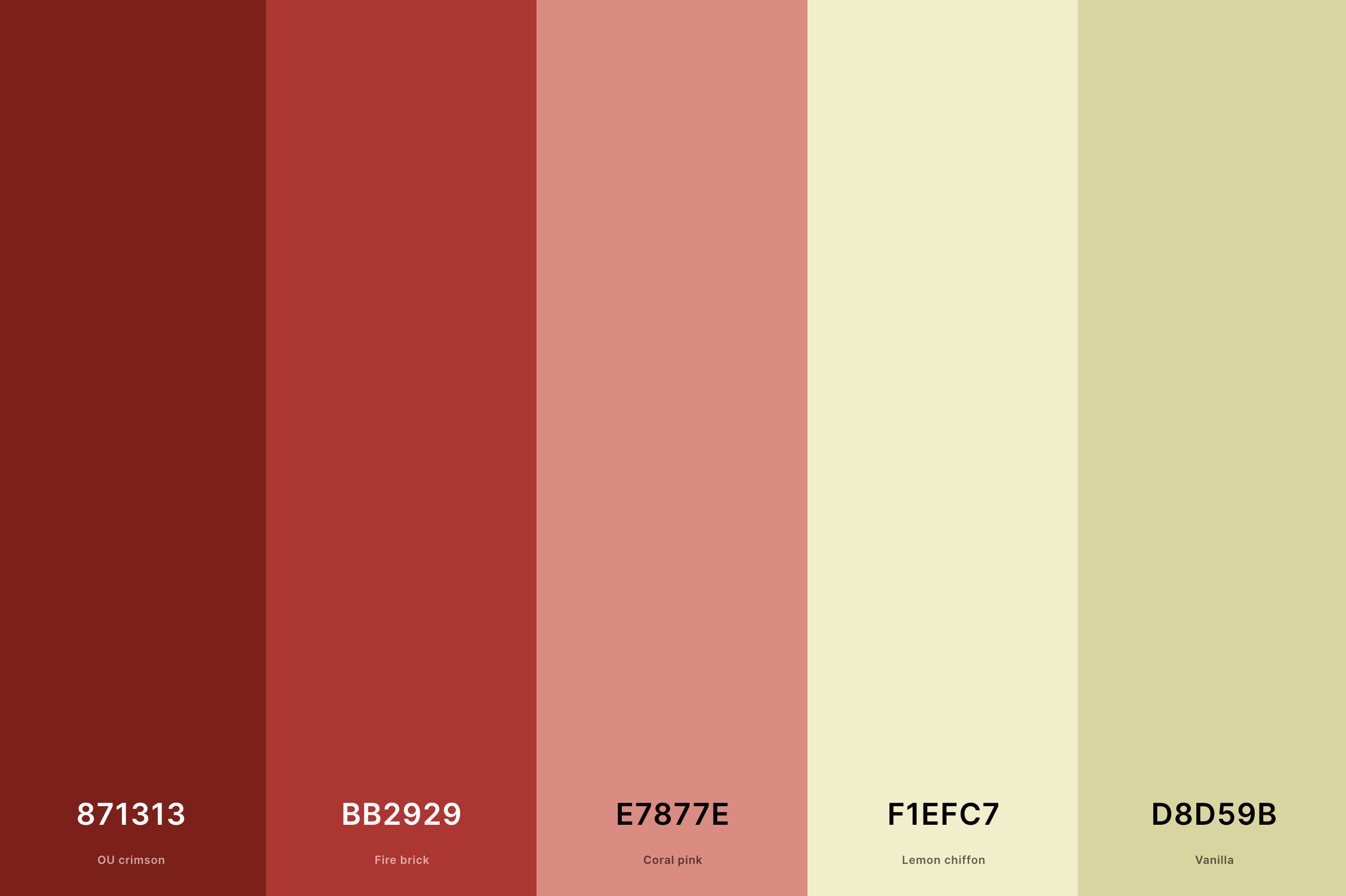
Hex Codes: #871313, #BB2929, #E7877E, #F1EFC7, #D8D59B
Bold and passionate, this palette combines the deep intensity of Ou Crimson and Fire Brick with the softer Coral Pink, balanced by the lightness of Lemon Chiffon and Vanilla.
It's like the dramatic flair of a vibrant bouquet, offering a sense of vitality and warmth. Perfect for spaces that desire a touch of drama and romance, this palette ignites the senses and stirs the soul.
21. Light Cream Color Palette
Floral White + Cornsilk + Lemon Chiffon + Lemon Chiffon + Vanilla
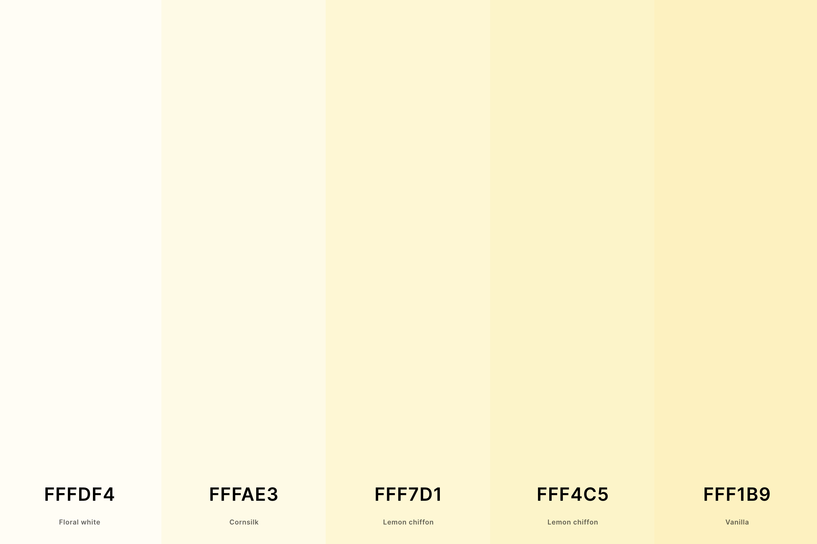
Hex Codes: #FFFDF4, #FFFAE3, #FFF7D1, #FFF4C5, #FFF1B9
This palette is the epitome of softness and subtlety, blending the whisper-soft Floral White and Cornsilk with the gentle Lemon Chiffon, creating layers of light and airy vibes.
It's reminiscent of a delicate lace curtain gently swaying in a spring breeze, inviting a sense of calm and purity. Ideal for spaces that aim to be serene, light-filled, and subtly sophisticated, this palette brings a whisper of elegance to any setting.
22. Dark Cream Color Palette
Drab Dark Brown + Reseda Green + Sage + Vanilla + Cream
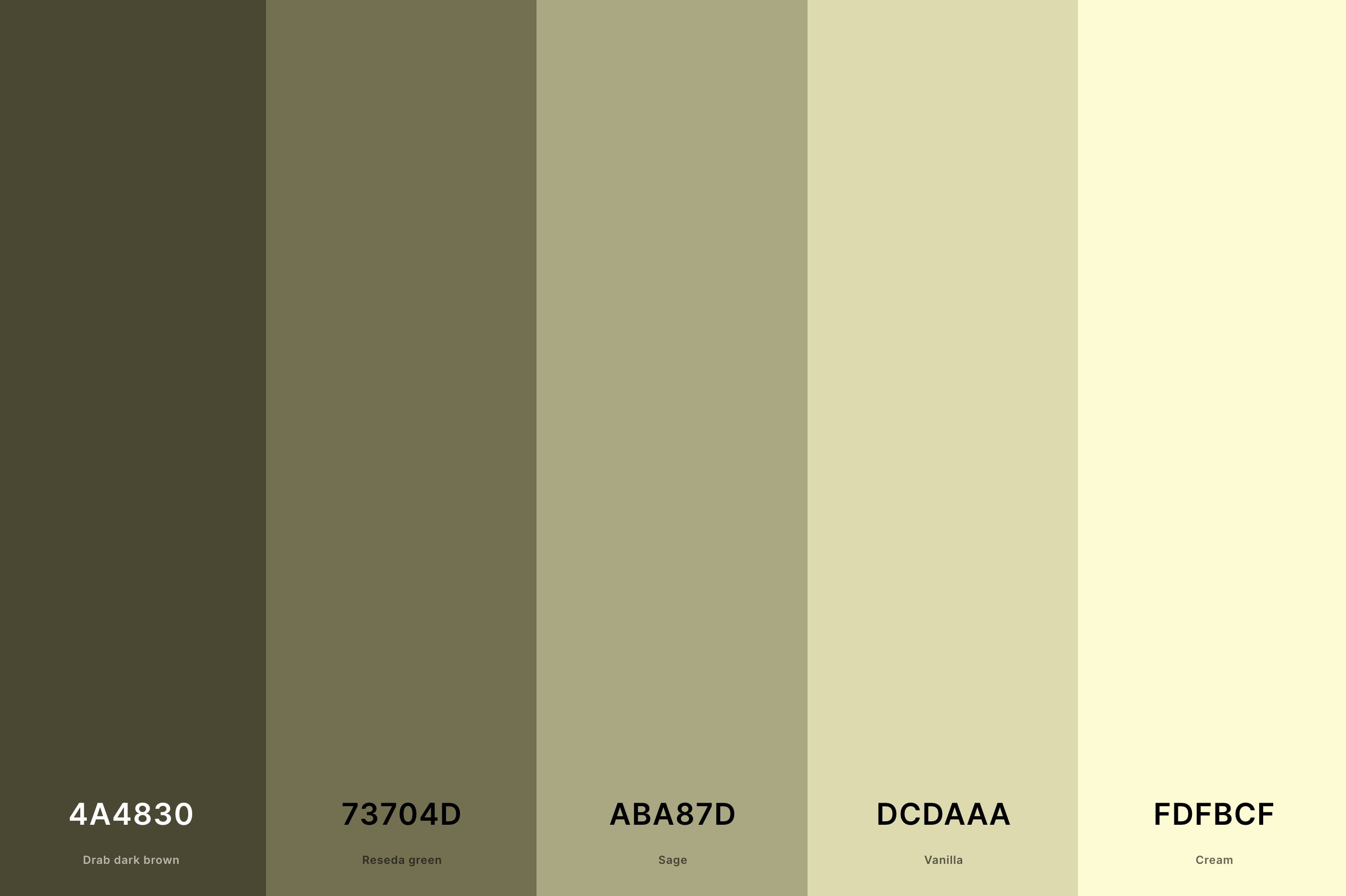
Hex Codes: #4A4830, #73704D, #ABA87D, #DCDAAA, #FDFBCF
Here we find a palette that combines the depth of Drab Dark Brown and Reseda Green with the earthy tones of Sage, lifted by the lighter Vanilla and Cream. It's like the deep, rich soil of a fertile land, promising growth and renewal.
Perfect for spaces that seek to convey depth, richness, and a connection to the earth, this palette offers a grounding yet uplifting ambiance.
23. Tan And Cream Color Palette
Lion + Tan + Dutch White + Lemon Chiffon + Cosmic Latte
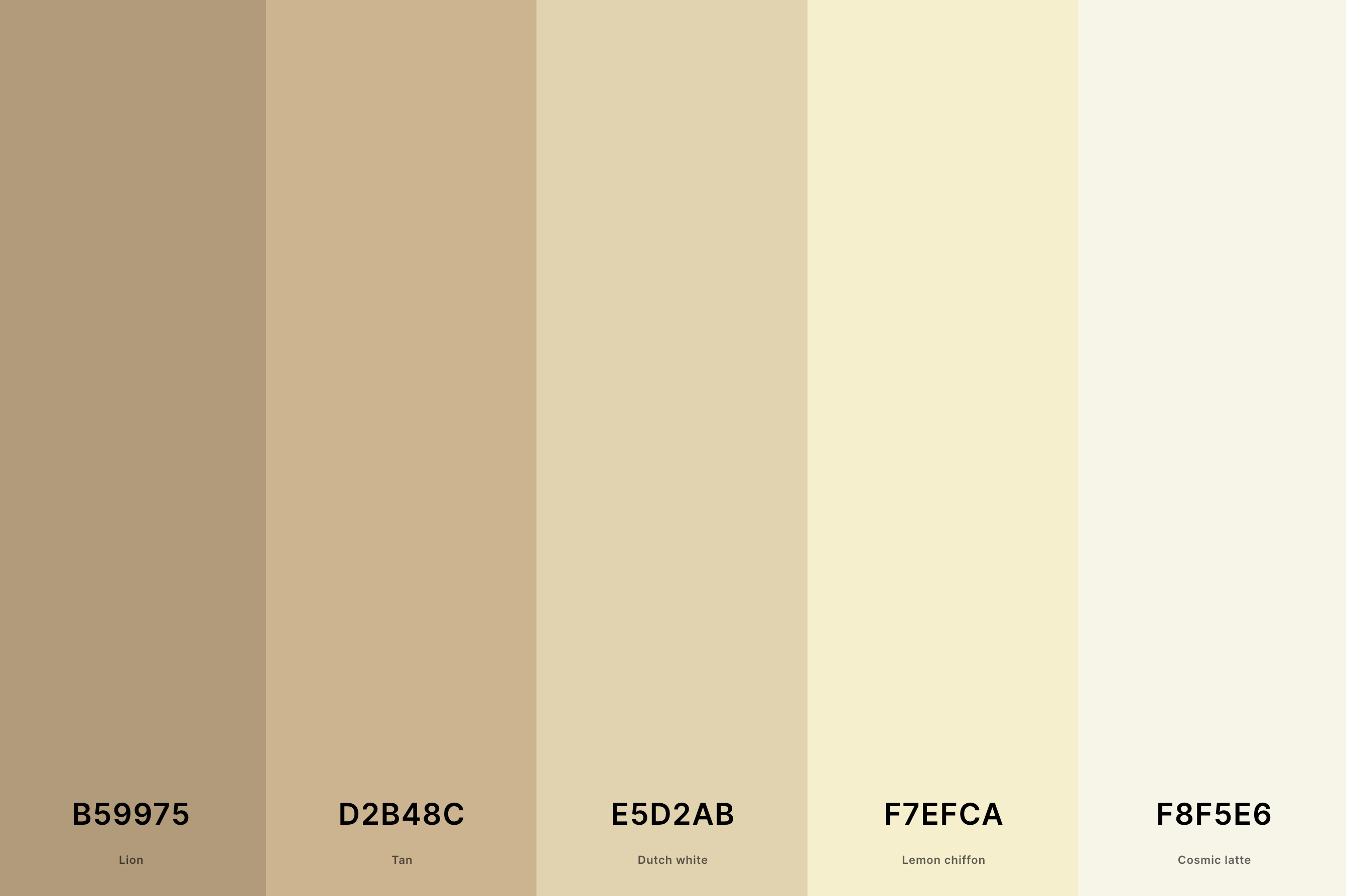
Hex Codes: #B59975, #D2B48C, #E5D2AB, #F7EFCA, #F8F5E6
Warm, welcoming, and effortlessly chic, this palette merges the cozy Lion and Tan with the sunny Dutch White, complemented by the softness of Lemon Chiffon and Cosmic Latte.
It's like the warm glow of late afternoon sun casting soft shadows, evoking a sense of comfort and warmth. Ideal for spaces that crave a casual elegance and a sunny disposition, this palette is like a soft, warm hug.
24. Cream And Maroon Color Palette
Black Bean + Maroon + Light Red + Cornsilk + Ecru
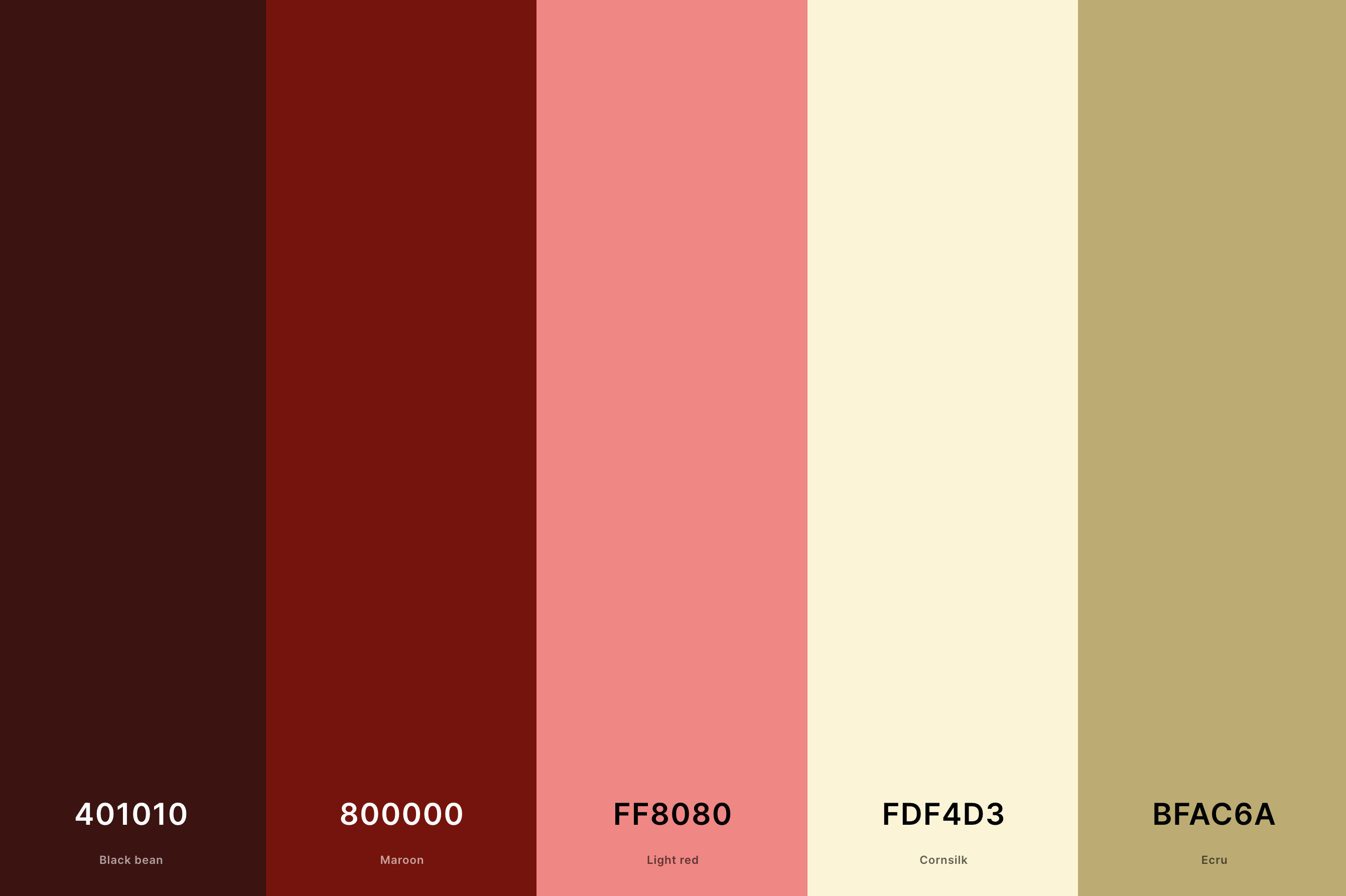
Hex Codes: #401010, #800000, #FF8080, #FDF4D3, #BFAC6A
This palette brings together the intense, deep Maroon and Black Bean with the soft glow of Light Red, balanced by the gentle Cornsilk and Ecru.
It's like the rich, velvety petals of a dark rose against a soft, creamy background, offering a sense of luxury and depth.
Perfect for spaces that aim to be striking, sophisticated, and imbued with a sense of mystery, this palette is all about bold contrasts and luxurious textures.
25. Vanilla Cream Color Palette
Khaki + Sunset + Vanilla + Cream + Sunset
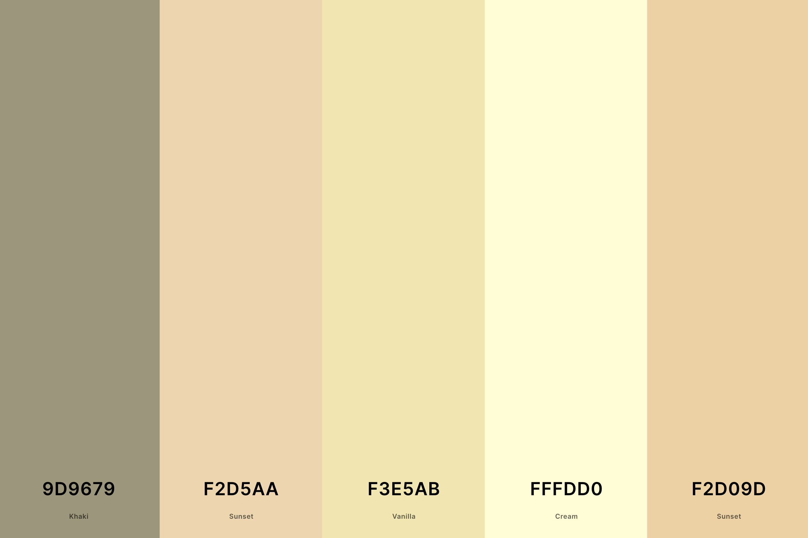
Hex Codes: #9D9679, #F2D5AA, #F3E5AB, #FFFDD0, #F2D09D
Soft, soothing, and delightfully comforting, this palette blends the earthy Khaki with the gentle warmth of Sunset and Vanilla, rounded off by the smooth Cream and Sunset hues.
It's like the sweet, comforting scent of vanilla in a warm, inviting kitchen, creating a space that feels like home.
Ideal for spaces that seek to be comforting, nurturing, and filled with the simple joys of home and hearth, this palette wraps you in a blanket of warmth and welcome.
26. Coconut Cream Color Palette
Coffee + Beaver + Rosy Brown + Dun + Cornsilk
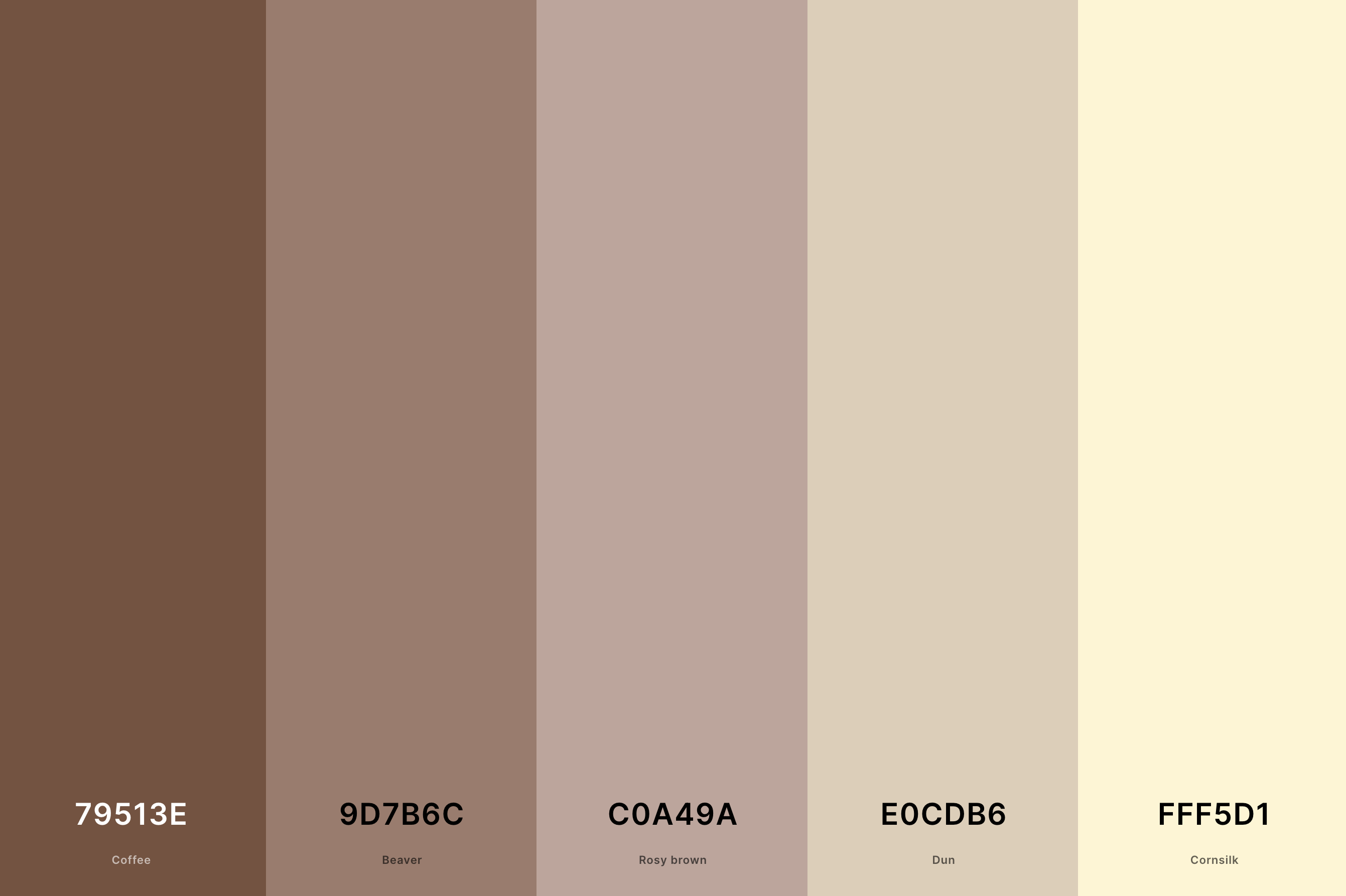
Hex Codes: #79513E, #9D7B6C, #C0A49A, #E0CDB6, #FFF5D1
This palette is a cozy blend of the warm Coffee and Beaver with the soft Rosy Brown, complemented by the lighter Dun and Cornsilk.
It's like the comforting embrace of a well-loved leather chair in a cozy corner of a café, surrounded by the rich aroma of freshly brewed coffee.
Ideal for spaces that aim to be warm, inviting, and full of depth, this palette evokes a sense of comfort and familiarity, perfect for creating a welcoming and relaxed atmosphere.
27. Cream And Olive Green Color Palette
Dark Green + Olive + Citron + Vanilla + Cream
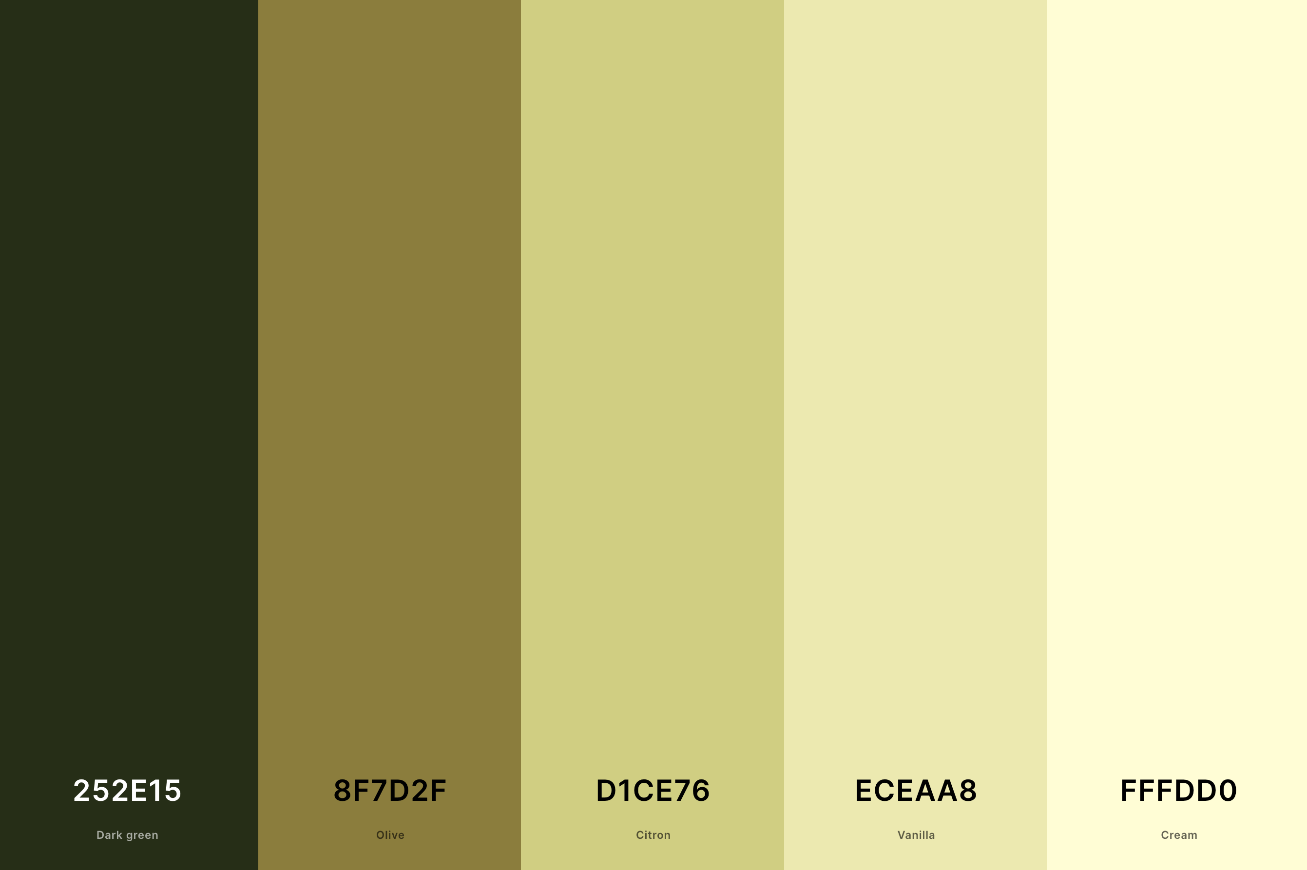
Hex Codes: #252E15, #8F7D2F, #D1CE76, #ECEAA8, #FFFDD0
Combining the depth of Dark Green and Olive with the lightness of Citron and Vanilla, balanced by the smoothness of Cream, this palette is like a walk through an ancient olive grove at dawn.
The earthy greens speak of nature's resilience and abundance, while the lighter tones bring a sense of freshness and light.
Perfect for spaces that seek to harmonize strength and softness, this palette offers a refreshing yet grounded ambiance, ideal for those who appreciate the beauty and bounty of the natural world.
What is the Complimentary Color of Cream?
Now, cream is this cozy, warm shade that kind of dances on the edge of whites and very light yellows. So, when we're on the hunt for its perfect match in the complementary color spectrum, we're looking at colors that can offer a delightful contrast while still harmonizing beautifully.
Imagine the gentle warmth of a cream color, like a soft light filling a room on a sunny morning. Now, picture this with a color that provides a gentle yet striking contrast.
We're talking about a soft, deep blue or a teal that leans more towards the green side. These colors have that magical ability to balance the warmth of cream with their cool, calming presence. It's like watching the ocean waves gently lapping against a sandy beach, where each element enhances the beauty of the other.
Incorporating a soft, deep blue or a rich teal into a space or design with cream creates this gorgeous balance that's both inviting and visually striking. It's all about creating a space that feels harmonious and inviting, with just the right amount of contrast to keep things interesting.
So next time you're playing with cream in your palette, don't forget to invite its complementary friend for that perfect balance!
What Colors Go With Cream?
When we think about what colors go with cream, imagine the endless possibilities that unfold. Cream, with its soft, warm undertones, is like a cozy blanket that wraps around other colors, bringing out their best features without overpowering them.
First off, let's talk about earthy tones. Think olive greens, deep browns, and rusted oranges. These colors alongside cream create a rich, inviting vibe that's reminiscent of a cozy autumn day. Then, there are the soft pastels—baby blues, gentle lavenders, and pale pinks. When paired with cream, they evoke a feeling of soft, airy lightness, like a breath of fresh spring air.
But let's not forget about the bold and beautiful. Navy, emerald green, and even a vibrant coral can stand next to cream and look absolutely stunning. The contrast is striking, yet the cream has this magical way of softening the overall look, making the space or design feel both vibrant and soothing at the same time.
So, whether you're leaning towards the subtle charm of pastels, the grounded feel of earth tones, or the dynamic energy of bold colors, cream is your go-to for creating a space that feels harmonious, balanced, and utterly beautiful. It's truly a chameleon in the color world, ready to support and enhance whatever palette you dream up!
